About this product

Generic UI libraries have buttons and forms. They don't have a streaming message, a tool-call display, an agent timeline, a context-window meter, or a model picker that shows cost per 1k tokens. That's the gap this pack fills — every component you'd otherwise rebuild from scratch on every AI project, ready to copy-paste into any shadcn/ui codebase.

What's actually inside

60 production-ready UI blocks across 7 categories — all built on shadcn/ui conventions (same CSS variables, same import patterns, same copy-paste approach), so they match your theme the moment you drop them in. Each block is a typed React component with sensible defaults.

  • AI Chat & Messaging (12): ChatWindow, ChatMessage with user/assistant bubbles, StreamingMessage (typing dots + token reveal), ChatInput with shortcuts, ChatSidebar with conversation history, ChatEmpty with starter prompts, CodeBlock with copy button, CitationCard with relevance score, ToolCallDisplay (name/args/status/result), AgentTimeline (step-by-step reasoning), VoiceInputButton with waveform animation, ReasoningBlock (expandable chain-of-thought).
  • Configuration & Controls (10): ModelPicker (with cost-per-1k inline), SystemPromptEditor with token counter, TemperatureSlider with presets, ParameterPanel (top_p / max_tokens / penalties), APIKeyInput with test-connection, ContextWindowMeter, ProviderSelector card grid, StopSequencesEditor, ResponseFormatToggle (text/JSON/schema), ToolsToggle.
  • RAG & Knowledge (8): DocumentUploader, DocumentList with status, SearchResultCard, CitationsList, KnowledgeBaseStats, EmbeddingStatusBadge, ChunkPreview, IndexProgress.
  • Usage & Billing (8): TokenUsageMeter, CreditBalance, UsageChart (recharts), PlanBadge, UsageBreakdown table, BillingAlert banner, CostBreakdown, ApiKeyUsage.
  • Onboarding & Empty States (8): AIOnboardingWizard multi-step, FeatureCard, EmptyConversation, SetupChecklist, WelcomeBanner, ConnectAccount, FirstPromptRunner, FeatureShowcase.
  • Feedback & Quality (6): MessageFeedback (thumbs + comment), RegenerateButton with options, ConfidenceIndicator, ErrorMessage with retry, SafetyWarning, LatencyBadge.
  • Layout & Navigation (8): AIAppShell, AppSidebar, MobileNav, CommandPalette (⌘K), ThemeToggle (light/dark/system), BreadcrumbNav, NotificationBell, UserMenu.

Plus a browsable showcase app

A full Next.js 15 App Router project sits at the pack root and renders every block in a clean, browsable catalog (think shadcn's own site). Sidebar nav with live search, one route per block, light/dark theme toggle, and a Copy code button that returns the exact .tsx source via an API route. Use it as your local preview tool and as a demo you can show clients.

Why it drops in cleanly

  • shadcn/ui conventions exactly: imports from @/components/ui/*, uses the standard cn() helper, respects the shadcn HSL CSS variables. Drop a block into any shadcn project and it matches the theme instantly.
  • Tailwind v4 CSS-first config — no tailwind.config.js. The pack ships styles/globals.css with the @theme block already set up.
  • TypeScript strict mode — every block compiles clean under strict: true.
  • Light + dark on every block. Verified via the bundled next-themes integration; no surprises.
  • Mobile-responsive throughout — including the showcase shell.

Who it's for

  • Founders building an AI product who'd rather not rebuild the chat UI for the third time.
  • Agencies shipping AI features for clients who want a high-quality starting point per project.
  • Engineering teams that have shadcn/ui set up and want AI-specific blocks that drop in without theme fights.

Verified, not aspirational

tsc --noEmit clean. next build succeeds with 65 routes pre-rendered. Smoke-tested via next start against a sampling of routes (all 200 OK). Every interactive block has the right "use client" boundary.

What's included

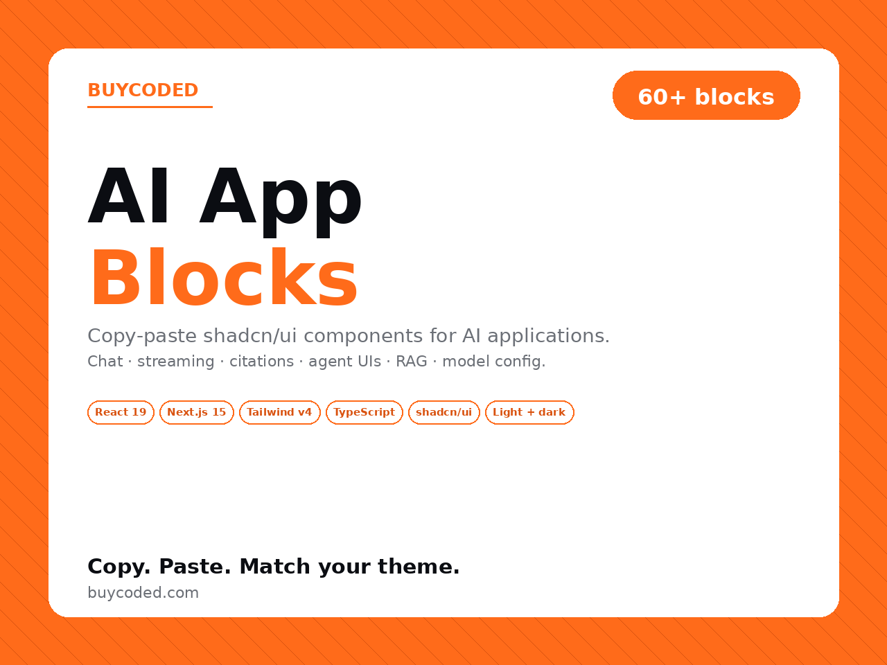
  • 60+ AI-specific copy-paste UI blocks (TSX) organized in 7 categories
  • Chat, streaming, citations, tool calls, agent timeline, RAG, model config, token metering, onboarding, feedback, layout, navigation
  • React 19 + Next.js 15 (App Router) + TypeScript strict + Tailwind v4 (CSS-first) + shadcn/ui
  • Browsable showcase Next.js app at the pack root — live preview + Copy code per block
  • shadcn/ui primitives (Button, Card, Input, ScrollArea, Tabs, Select, Dropdown, etc.) included so the showcase runs out of the box
  • Light + dark mode on every block via shadcn HSL CSS variables; ThemeToggle component included
  • Mobile-responsive throughout
  • Verified — tsc clean, next build clean, 65 routes pre-rendered
  • Commercial license — unlimited personal + client / agency use
FAQ

About Shadcn/Tailwind AI App Blocks — 60+ Copy-Paste Components

?

Do these work with my existing shadcn/ui project?

Yes — they follow shadcn/ui conventions exactly. Same CSS variables (--primary, --foreground, --muted, etc.), same import patterns (@/components/ui/button, etc.), same copy-paste approach. Drop a block into any shadcn project and it picks up your theme instantly — no re-styling. INSTALL.md has a step-by-step walkthrough including which shadcn primitives each block needs.

?

Why AI-specific blocks instead of generic UI?

Generic UI libraries — including shadcn/ui itself — give you buttons, forms, dropdowns. They don't have a streaming message with token-by-token reveal, an agent timeline showing reasoning steps with durations, a tool-call display with status pills, a citation card with relevance scores, a context-window meter with token-budget visualization, or a model picker that surfaces provider + context size + cost per 1k tokens. These are the AI-app components everyone rebuilds from scratch. This pack fills that gap.

?

How do I preview them before integrating?

A browsable Next.js 15 showcase app is included at the pack root. Run pnpm install + pnpm dev → localhost:3000 and you get a catalog of all 60 blocks with sidebar nav, live search, theme toggle (light/dark/system), and one route per block. Each block page has a Preview tab and a Code tab — the Code tab serves the raw .tsx source via /api/source so the Copy code button gives you the exact file contents to drop into your project.

?

Do they support dark mode?

Yes — every block. They use the standard shadcn/ui HSL CSS variables (--background, --foreground, --primary, --muted, --border, etc.), which means they respect whatever your theme provider sets. The pack ships a ThemeToggle block + next-themes integration so you can preview light/dark in the showcase, but the blocks themselves don't require next-themes — they just use the CSS variables.

?

Can I use these in commercial client projects?

Yes — the license covers unlimited personal AND client / agency use. Use blocks in projects you ship to clients, customize per project, rebrand the look entirely, bill normally. You can remove BuyCoded attribution from your derivative work. The one restriction: you can't resell the block pack itself or repackage it as a competing component library. See LICENSE.txt for the exact terms.

?

What's verified, what's aspirational?

Verified: tsc --noEmit clean, next build succeeds with all 65 routes pre-rendered, runtime smoke test against next start (9/9 sampled routes returned 200). Every interactive block has the right 'use client' boundary so server-rendering works. Components import the right primitives from @/components/ui/*. What's not literally verified: every single one of the 60 blocks visually in every browser at every viewport — we tested the showcase end-to-end, but tweak anything you ship to production after a side-by-side check in your target environment. (No one ships a UI without that.)

?

What if I'm using Tailwind v3 instead of v4?

The blocks themselves only use utility classes that exist in both v3 and v4 — the difference is the config style. The pack ships a Tailwind v4 CSS-first globals.css. If you're on v3, copy the shadcn CSS variable block out of globals.css into your own tailwind.config.js + globals.css and the blocks will work. Most blocks don't reference any v4-only features.

?

How big is the pack? Do I need to use the whole thing?

No — copy what you want, leave the rest. Each block is a single .tsx file with no inter-block dependencies. The full pack is ~1.5 MB on disk (mostly the showcase project structure). You can `cp` any individual block into your app and ignore the rest of the repo.